But that doesn’t appear to be the case with the OP 11, with respect to the latter point. If you’re jumping ship from the OnePlus 10 Pro or 10T, the difference between the last generation models and this one has practically been kept to a minimum. What I mean by that is this: as for as aesthetics go, the only thing that has been tweaked is the design of the main camera module’s housing.
From square to circular in one generation.
Where the OnePlus 10 series maintained a relatively safer square-shaped module and housing, all the main sensors of the OP 11 are now housed within what I can describe as a textured, circular housing. However, unlike its predecessors, the entire module is also “seamlessly” connected to the edge of the phone, a design tick that the engineers at OnePlus seem to be quite proud of. Honestly, I say seamlessly, but if you peer close enough, you can actually see the breakoff between the module and the phone’s edge. Seriously, you can’t miss it. Oh, and you can also see the Hasselblad marking right smack in the middle of the main camera.
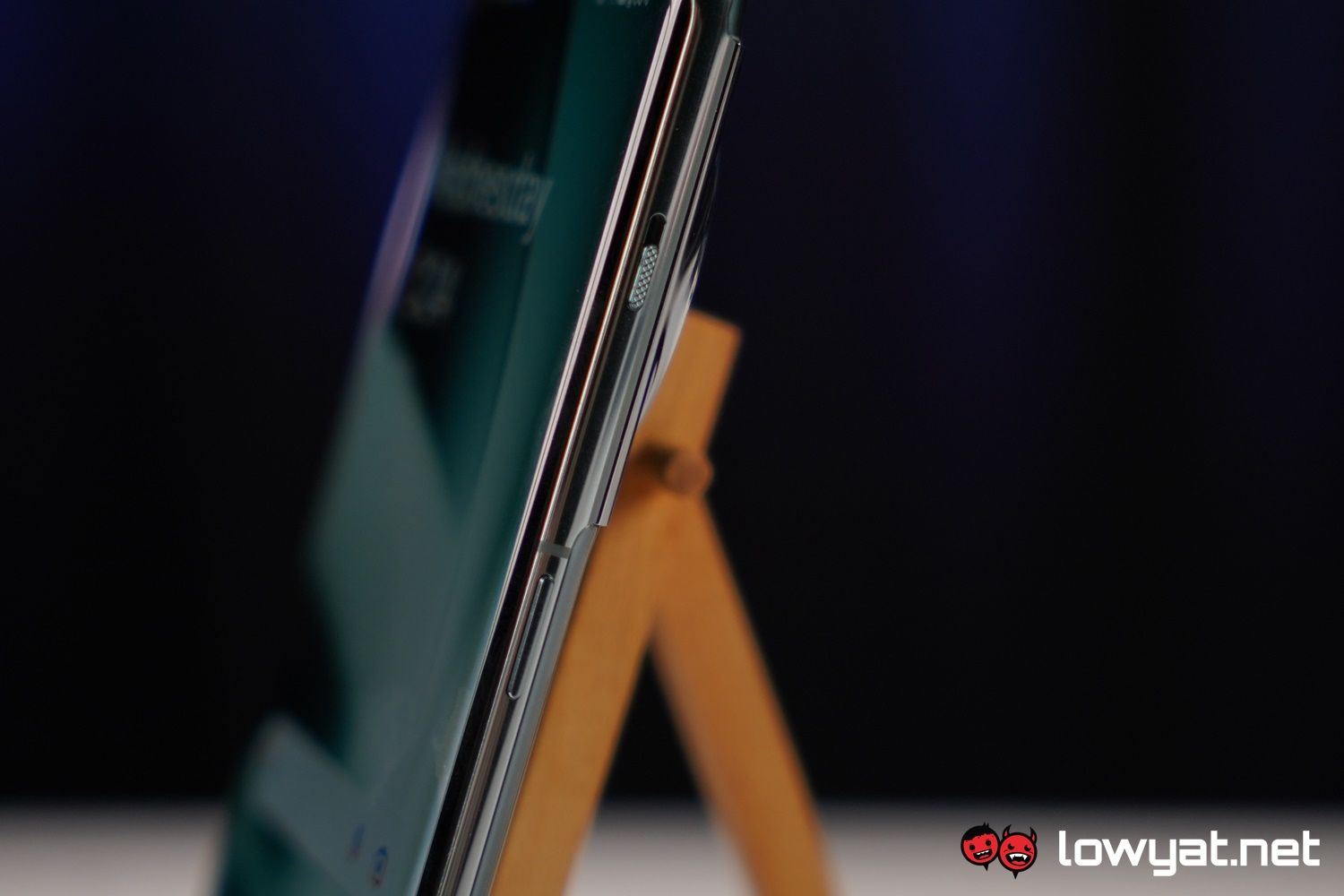
The one anticipated feature of the OP 11 is also a returning feature: the slider. To this day, I don’t understand why OnePlus never bothered keeping such an iconic feature with the last generation but for what it’s worth, I am glad that it is back. This is still one of the most defining features of the brand, and an absolute boon for quickly switching between ringing, vibration, and silent modes.
Green or Black. Those are your choices right now.
Colour options for the OP 11 are, unsurprisingly, limited this time around. The unit we have is Emerald Green, which is a glossy glass finish and, if I’m honest, an absolute fingerprint magnet. The second option is a textured black finish that feels and looks much better, but if I’m honest, it is nowhere near that rugged, grippy texture that is the sandstone texture. In my opinion, that was truly one of the best texture application on a phone and it’s a shame that that was never revisited by OnePlus.
As for the specifications of the OP 11, I regret to tell you that I am unable to share them with you in this article today, as the brand is still keeping things under wraps. And this is despite the fact that the entire specs sheet has already been shared in China. I am also, unfortunately, unable to share any sample images captured using the phone’s main camera and the Hasselblad imaging technology that drives it. We’ll just have to wait until 7 February this year, in order to fully know what we’re getting with the OP 11. Despite, yet again, the world already knowing what is pretty much set to ship out with the phone. Additional photography by Maheshan Mohan and Adrian Low.


title: “Oneplus 11 Hands On A New Form Of Hasselblad Sort Of” ShowToc: true date: “2022-12-02” author: “William Buddenhagen”
But that doesn’t appear to be the case with the OP 11, with respect to the latter point. If you’re jumping ship from the OnePlus 10 Pro or 10T, the difference between the last generation models and this one has practically been kept to a minimum. What I mean by that is this: as for as aesthetics go, the only thing that has been tweaked is the design of the main camera module’s housing.
From square to circular in one generation.
Where the OnePlus 10 series maintained a relatively safer square-shaped module and housing, all the main sensors of the OP 11 are now housed within what I can describe as a textured, circular housing. However, unlike its predecessors, the entire module is also “seamlessly” connected to the edge of the phone, a design tick that the engineers at OnePlus seem to be quite proud of. Honestly, I say seamlessly, but if you peer close enough, you can actually see the breakoff between the module and the phone’s edge. Seriously, you can’t miss it. Oh, and you can also see the Hasselblad marking right smack in the middle of the main camera.
The one anticipated feature of the OP 11 is also a returning feature: the slider. To this day, I don’t understand why OnePlus never bothered keeping such an iconic feature with the last generation but for what it’s worth, I am glad that it is back. This is still one of the most defining features of the brand, and an absolute boon for quickly switching between ringing, vibration, and silent modes.
Green or Black. Those are your choices right now.
Colour options for the OP 11 are, unsurprisingly, limited this time around. The unit we have is Emerald Green, which is a glossy glass finish and, if I’m honest, an absolute fingerprint magnet. The second option is a textured black finish that feels and looks much better, but if I’m honest, it is nowhere near that rugged, grippy texture that is the sandstone texture. In my opinion, that was truly one of the best texture application on a phone and it’s a shame that that was never revisited by OnePlus.
As for the specifications of the OP 11, I regret to tell you that I am unable to share them with you in this article today, as the brand is still keeping things under wraps. And this is despite the fact that the entire specs sheet has already been shared in China. I am also, unfortunately, unable to share any sample images captured using the phone’s main camera and the Hasselblad imaging technology that drives it. We’ll just have to wait until 7 February this year, in order to fully know what we’re getting with the OP 11. Despite, yet again, the world already knowing what is pretty much set to ship out with the phone. Additional photography by Maheshan Mohan and Adrian Low.

