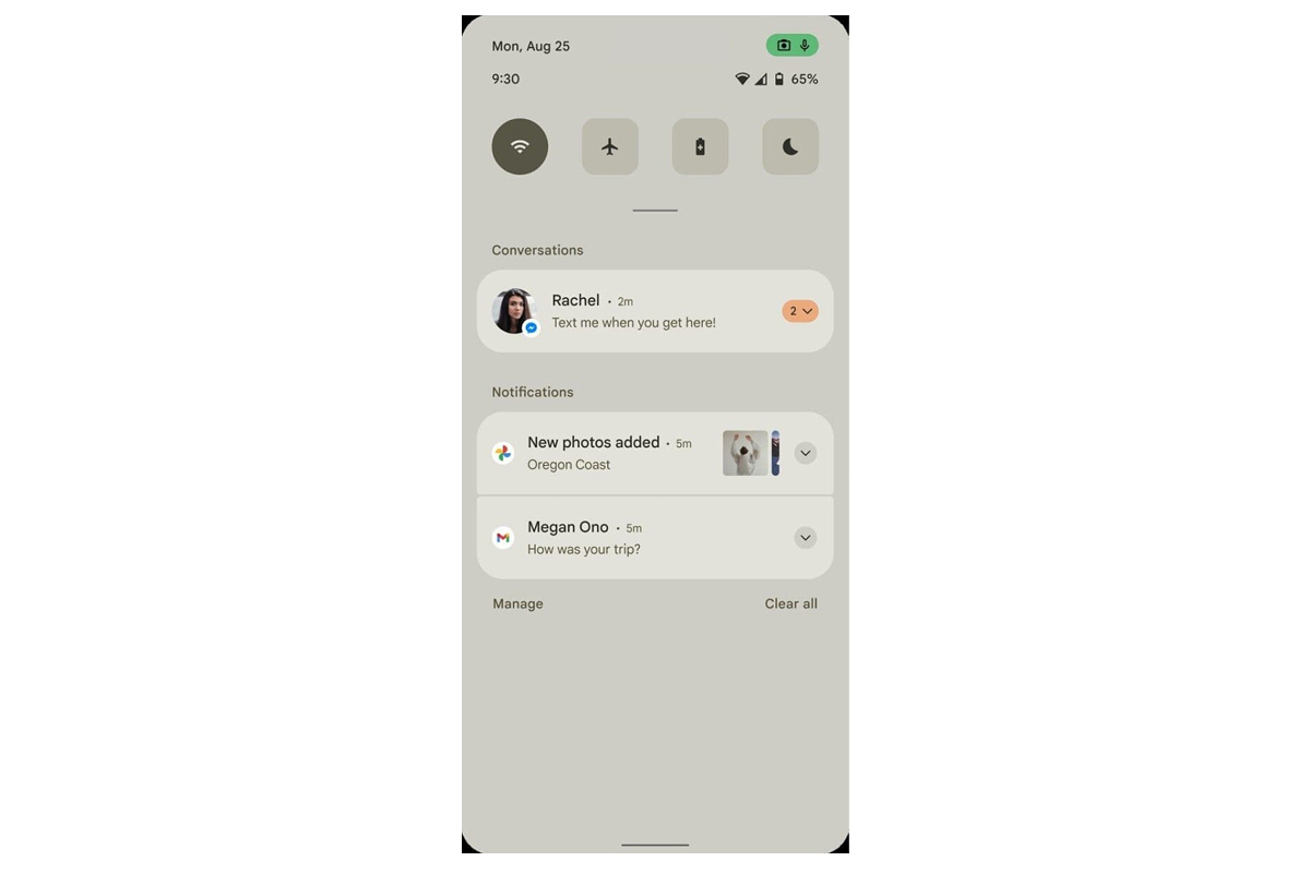
First reported by XDA via senior forum member RKBD, this leak has been made available ahead of the planned Android 12 Developer Preview that is expected to be rolling out this month. The site added that the mockup is also accompanied by an alleged early draft of a document summarising the expected changes to be featured in the upcoming upgrade. XDA could not vouch whether the leak is indeed real, but noted the high chance of its authenticity based on procured evidence from a trusted source. As seen from the mockup, the first noticeable difference found on the alleged Android 12 UI is the new clean and minimalist design. The pull down menu no longer exhibits a transparent background, but instead features a light opaque colour – shown in light beige, a theme that is consistent throughout the provided screenshots. Based on previous iterations of Android, it is believed that the overall theme is fully customisable based on user preference. While it is not shown along with the mockups, a Dark Mode feature is likely available as well which may display the interface differently with colours that are more favourable for low light conditions.
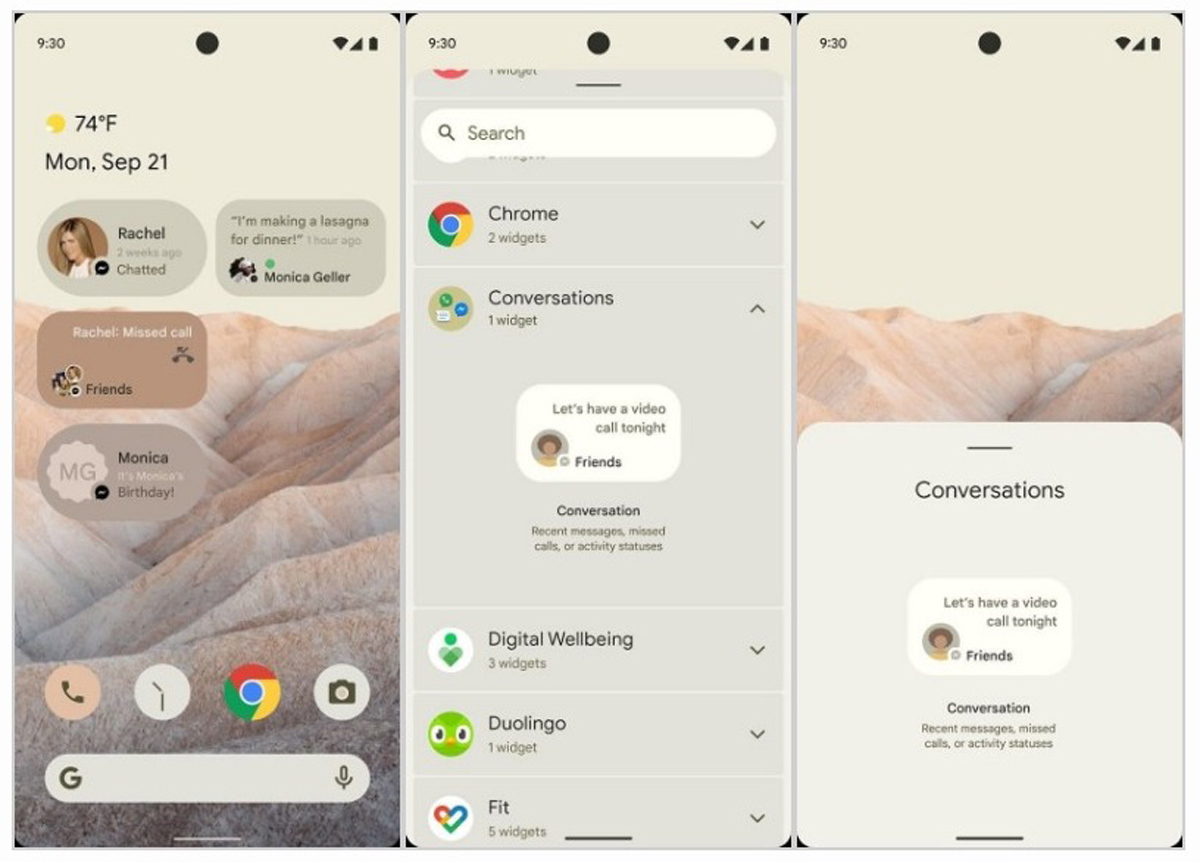
The pull down menu also shows four large Quick Settings icons on top, instead of the usual (and smaller) six tiles that we’re accustomed to from previous Android versions. Besides that, the rounded corners of each notification on the new UI appear more profound than before – a design that reflects Google’s new look that was first shown off in its Search web page update on mobile. There’s also a new Conversations widget which highlights recent messages, missed calls and activity status as shown in the mockup – all nicely packed in a small bubble when placed on the home screen. Without a doubt, this new addition is the company’s answer to Apple’s new widget feature that was introduced in iOS 14, which XDA argued was significantly better than what Android could offer.
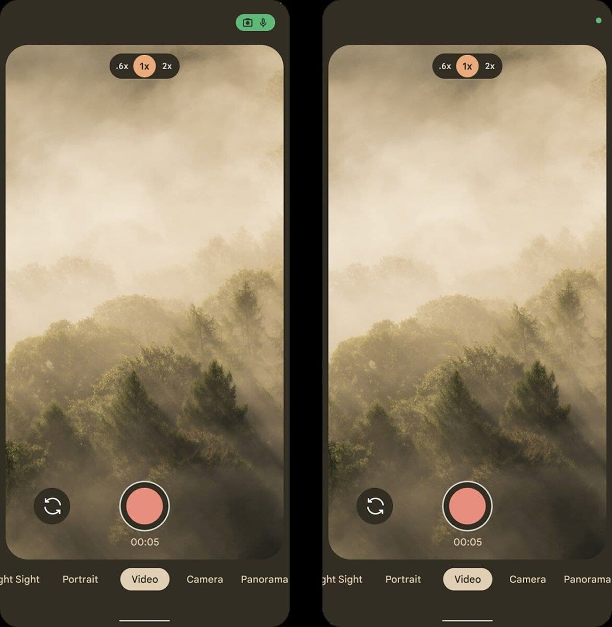
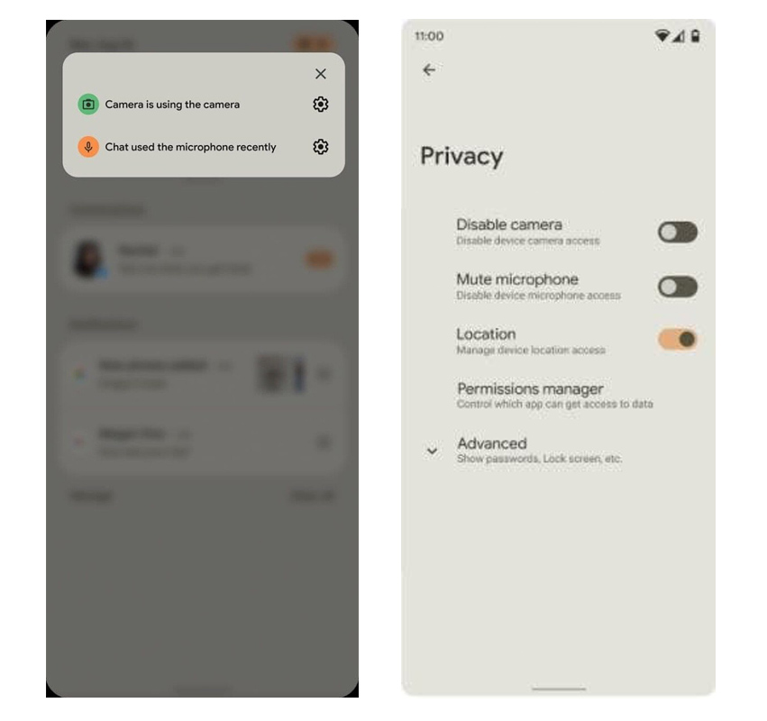
It’s also worth noting that Android 12 has swapped the date and clock positions on top of the interface. A more significant addition to the top display is the new row above the Wi-Fi, signal strength and battery icons, which is exclusively reserved for the system’s new privacy indicators. These new icons alert the user if an app is accessing the phone’s camera or microphone. It is said that Google is planning to mandate the inclusion of these privacy indicators, which must be shown whenever these features are accessed, and they must be displayed in the same colour across the ecosystem for user awareness. According to the supplied documentation, tapping these icons will display which apps are using the microphone or camera via a pop-up on top of the screen.
In addition, the Privacy setting on Android 12 has been revamped as well, giving users more control over their smartphones. On top of providing them the ability to disable location access, the menu now contains toggles to disable the camera and mute the microphone entirely. A handy Sensors Off shortcut is also available in Quick Settings within the pull down menu, which – as its name suggests – disables all sensors on the device. XDA noted that this tile is only available when Developer Options is activated, although there is a chance that Google may have this toggle available in the Privacy menu for easy user accessibility in the public release. On first impression, the supposed new Android 12 UI offers a very eye-pleasing design which arranges widgets and notifications nicely on screen with significant breathing room in between, avoiding any sense of clutter – according to the mockup, at least. The newly introduced privacy features are much welcomed as well, and what better time to debut them especially with all the recent heat Google has been receiving related to user privacy concerns. Also, do keep in mind that smartphone brands such as Samsung and Xiaomi will likely change certain design elements in their custom version of the new Android OS, as seen in previous iterations. What has been showcased in this alleged mockup may just be the tip of a larger iceberg. Google is expected to introduce and even test more updated and new features for Android 12 in the near future. Based on the previous version’s launch, there’s a chance the company may debut its OS upgrade by fall 2021. (Source / Images: XDA)


